Quality Control

Quality Control

This section contains quality control plots and statistics for the methylation data.

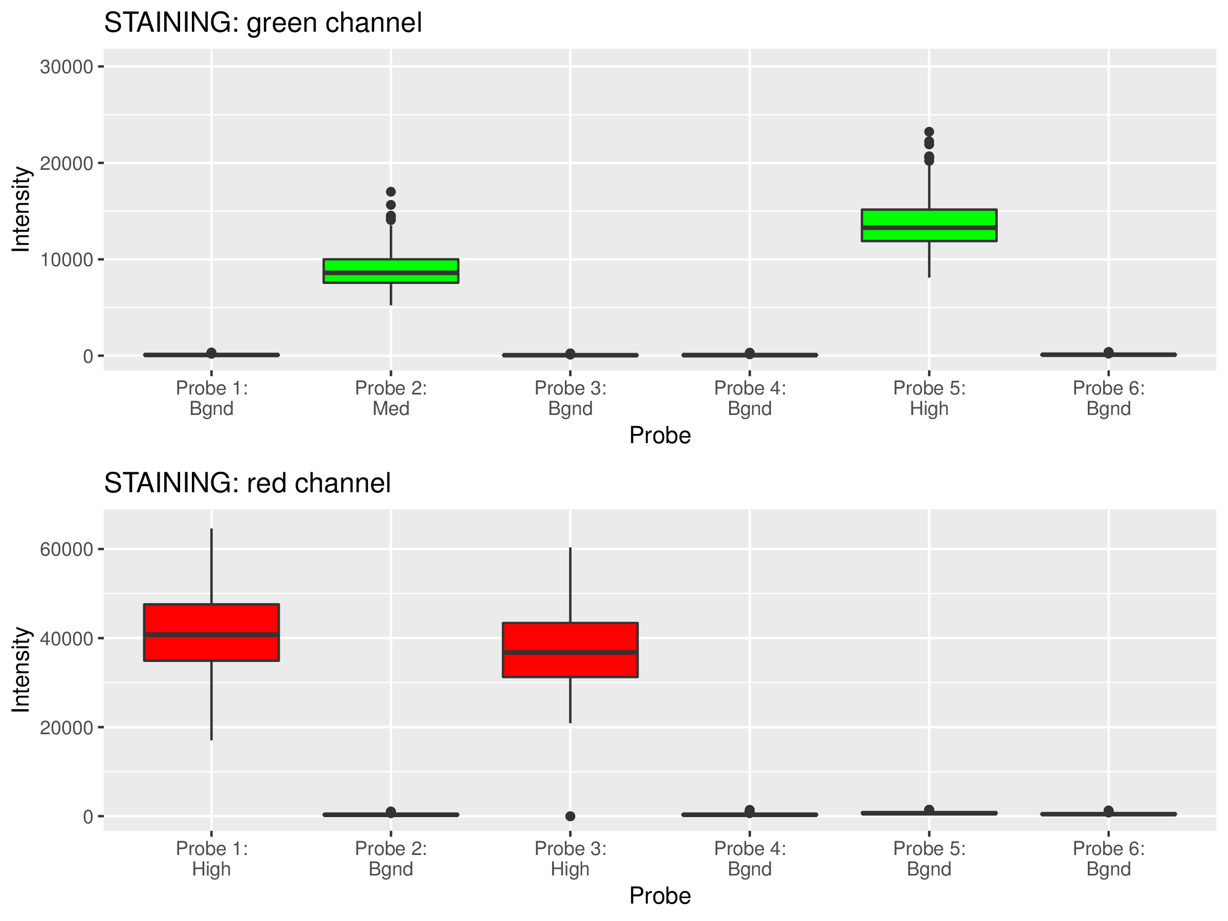
Quality Control Box Plots

Each box plot below shows the signal distribution of quality control probes across all samples. The control box plots are separated by control types. Detailed description of the control probes is given in the RnBeads vignette.

Control probe type

Figure 1

Open PDF Figure 1

Quality control box plots.

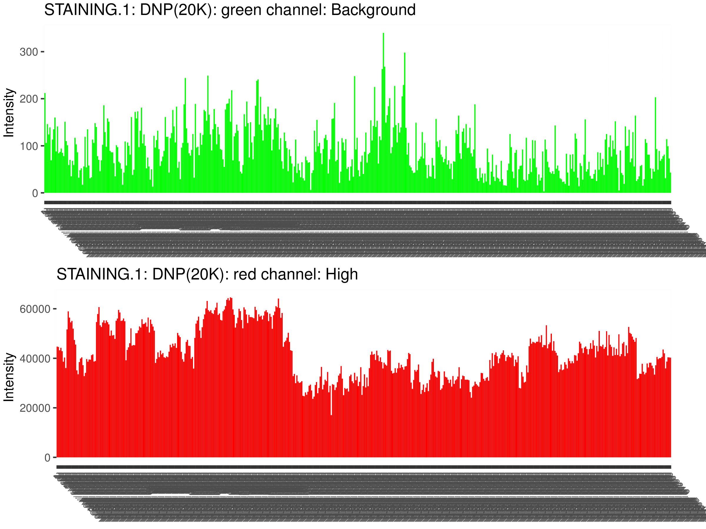
Quality Control Bar Plots

The plots below visualize the exact signal levels at each quality control probe. Note that the scale is not standardized. Background signal is usualy at the level of 1000 to 2000.

Samples #:
Control probe ID

Figure 2

Open PDF Figure 2

Quality control bar plots.

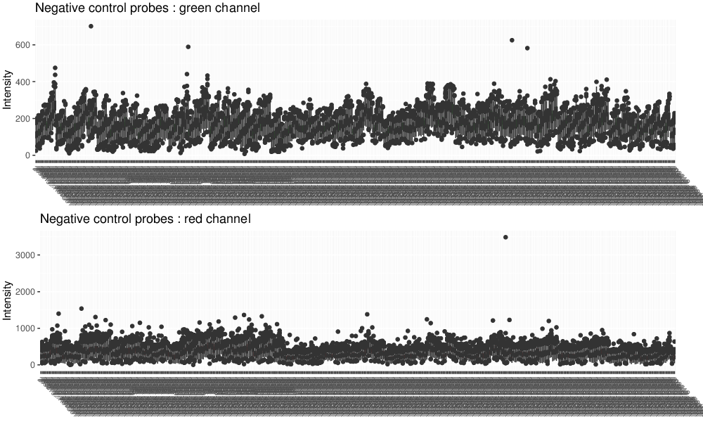
Negative Control Box Plots

Negative control box plots visualize background intensity distributions of all analyzed samples. Samples with skewed distributions and high medians are likely to be of low quality and should be discarded from the analysis.

Samples #:

Figure 3

Open PDF Figure 3

Box plots of the negative control probes.

Visualization of SNP Probe Data

Analysis of the values of the SNP-based probes can help identify sample mixups.

SNP Heatmap

SNP heatmap enables the identification of sample mixups in particular for genetically matched designs.

Figure 4

Open PDF Figure 4

Heatmap of the SNP probes. Euclidean distance and complete linkage are used for constructing the dendrograms. Samples with the same genetic background are expected to cluster together.

SNP-based Distances

If we inspect the dataset in the space defined by the SNP probes only, samples appearing close to each other are genetically similar.

The figure below shows the samples in the first two principal components of the space defined by the 57 SNP probes.

Display samples as

Figure 5

Open PDF Figure 5

Scatter plot showing the samples in a space defined by the signal of their SNP probes.

The full table of all pairwise distances is stored in a dedicated comma-separated file accompanying this report.

Sex Prediction

RnBeads predicted the sex of the samples in the dataset using a logistic regression model. The results are summarized in the table below.

Sex Samples
1 female 226
2 male 350
3 unknown 0

Sex was predicted based on the increase (or decrease) of mean signal intensities in the sex chromosomes w.r.t. the corresponding value in autosomes. The figure below displays these characteristics of the samples.

Colors denote

Figure 6

Open PDF Figure 6

Sex prediction based on mean signal increase. The decision boundary between the two sexes is visualized by a black line. Sample colors denote predicted male probability / sex.